SAP Product Cockpit
Overview
Aside from collaborative development sprints with engineers and product owners, my role would often lead to working directly with departmental heads wanting to redefine product approaches. This was the situation with the Cockpit application. The stakeholder wanted something very different and motion-based that was visually striking and would move things in a new direction.
This particular user group was well known to me, having collaborated on past projects within Customer Success and I was able to draw upon an existing qualitative knowledgebase that I could use as the basis for my initial design approaches and share via discovery calls in order to gauge sentiment. Following the motion objective I steered the design toward a dynamic layout and a playful interactivity along with a supporting bold colour scheme.
Background & Challenges
One of the largest challenges was a late request to move from the original brief for a fixed number of application pillars to designing for an unknown quantity, because custom application pillars were added to the scope. I accommodated this change by displaying the sub applications horizontally and opening the data card from beneath, which played to the desired motion objective and we can accommodate the required 7 - 8 application pillars before any scaling effects are necessary.
Stakeholder Expectations
Managing expectations when designing a motion-based product can be a difficult task and I was careful to involve our development engineers at all key design stages - either during daily calls or in separate discovery meetings. We worked through implementation challenges together and I kept in regular communication with the product owner to ensure alignment during all critical phases of the development cycle.
The first release of Cockpit happened last year and we have a very faithful representation of this prototype delivered. What you see above is the presentation layer, beneath which we've made several development enhancements in areas of Showrooms that can be fully visualised now which would not have been possible beforehand.
Launching Cockpit
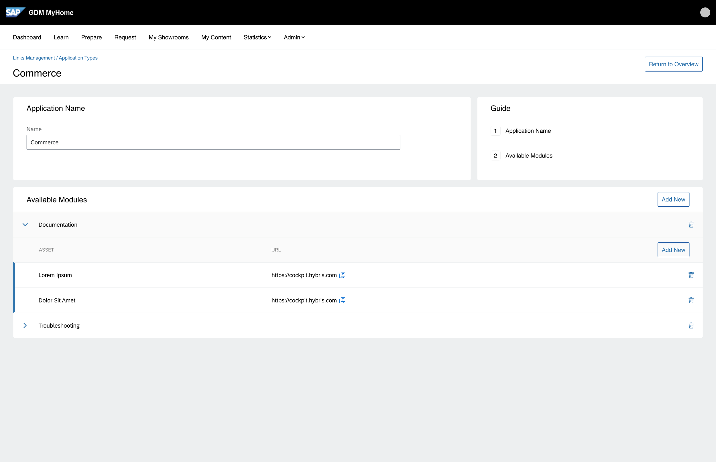
Data Card Content Management UX Workflow
I designed these screens based on the internal design framework (Fiori) with a few of my own custom library components to allow users to manage the data cards for each application within their cockpit environment. I’ve created and maintained a large number of bespoke components within custom libraries - alongside detailed form controls and interaction styles designed by myself that had influence outside of the department and could be seen in other areas of SAP, which is always nice feedback to receive.


Cockpit Management UX for Default and Custom Pillars
This flow describes how default and custom application pillars are assigned and managed within GDM MyHome for Cockpits along with my implementation notes for developers.


